
You have completed your blog setup. Now let us move to customization. There are lots of customization you can do. Customization is nothing but modifying the design of your blog. It’s all about the look and feel.
Let us start with the theme.
WordPress Themes
What is a theme?
In simple words, the theme is the design of your blog. That is how your readers will remember your blog.
Themes are ready-made designs that are available for all types of websites. It is a group of files (graphics, style sheets, and code) that is responsible for your website design.
You can change any theme easily in a matter of a few clicks.
WordPress has lots of free and premium themes. But I would always suggest you go for a premium theme due to its quality, starter guides, and support.
There are many reasons why you should choose a premium theme over a free theme. But that is a separate article for another day.
My Top Recommendations
There are many more premium WordPress theme clubs out there, but I recommend any of the below themes for a professional start.
Generate Press
GeneratePress is a lightweight WordPress theme built with a focus on speed, performance, and usability. Turnallstones is using Generatepress.
Genesis
This is one of the widely used frameworks. It includes many functionalities. you can customize it according to any extent.
Astra
Astra is one of the best themes for new bloggers. It is a lightweight theme. It contains many templates for all kinds of websites.
Steps to Change Your Theme
1. First login to your administrator dashboard by entering your username and password.
2. Go to Appearance-> Themes from this left menu.
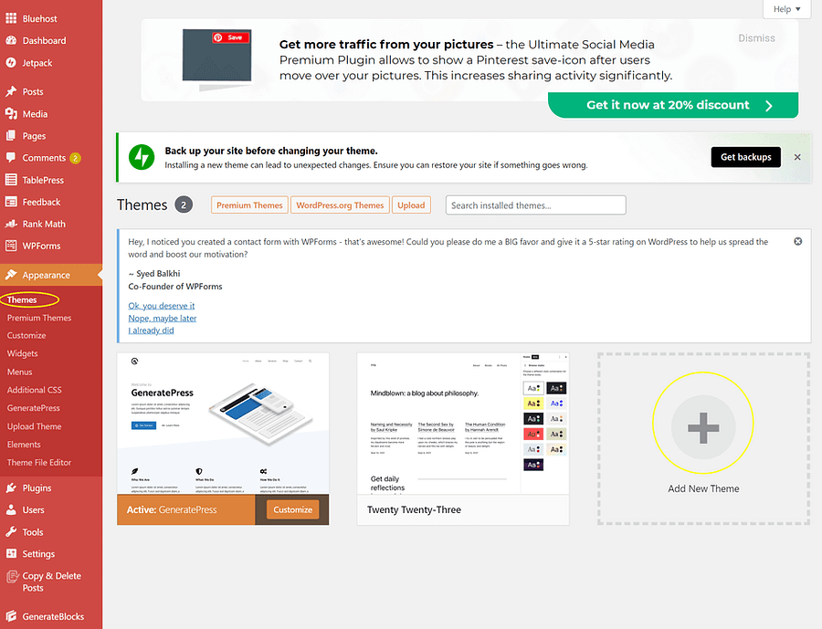
Here you can see the activated default theme of WordPress.
If you are ok with this theme, then you can proceed to other customizations.
Anyhow, I will share with you the details of how to change your theme.
On the same page, you can see WordPress themes readily available like Twenty Nineteen, Twenty Twenty, and Twenty Twenty-One.
These themes are simple and clean themes that can be to any kind of blog.
3. To change any other installed theme, you have to hover over the theme and click the “Activate” button. That’s it!
The design of your blog is changed with just one click!
You can also search and install other themes if you want.
4. To install a new WordPress theme, just click on “Add New Theme”.

There you can see thousands of free WordPress themes readily available.
You can also filter the themes by clicking the popular or latest links( check the above image).
You can use the preview button on any theme by clicking the preview button of the respective theme.
5. Once you finalized the theme click on the Install button and then click the “Activate” button.
You are done!!
In case you want to upload any theme from your computer(It happens when you want to install a premium theme), you can upload that by clicking the upload button and selecting the theme folder from your computer.

Now click the install button. It may take some time depending on the size of the theme folder.
Once the theme is installed, click the “Activate” button.
Thats it! You have changed your theme successfully!
Colors and Font
Click on the arrows below to see the detailed guide for each topic:
Finalize Your Branding Colors
It is important to understand that the colors you choose for your website trigger certain emotions in your readers. Each color has its own personality that influences human behavior and responses.
For example, red inspires passion and energy, while blue Implies dependability and reassurance of trust, power, and reliability. Green implies freshness and nature.
Why color palette is important?
Colors can become a memorable part of your brand. The choice of color can make or break your website’s overall design.
There is a lot behind color psychology. It can increase your brand recognition and readability. Neil Patel has written a detailed article regarding the same.
The color of your content, call-to-action(CTA) buttons, and links influence how your customers respond to your marketing messages. Even minor modifications like changing the color of CTA buttons can dramatically increase your success rates.
It’s all about understanding the mindset of your readers. But Do remember, it doesn’t give guaranteed results, because not every individual responds to colors in the same way.
But I would suggest you not ignore color psychology and its impact. Give it a try!
You can use these color schemes in different elements like:
- Images
- Headline
- Sub Headlines
- Borders
- Background
- Buttons(CTA)
- Popups
- Logos
- Favicons
- Branding
- Landing Page
- Menu Bar
- Footer Bar
- Featured Images
- Social Media Posts
- Cover Photos
- Email Marketing
- Videos
Points To Remember
- Don’t go overboard. Too many colors can create a sense of confusion and reduce readability.
- Red, Green, Blue, Purple, Black, and Orange are standard colors to increase conversions. It attracts both genders.
- Your secondary color should complement your primary color.
- Your CTA needs to be at the contrast color.
How to choose colors for my website?
To begin, I recommend choosing three colors for your color palette.
- Primary Color
- Secondary Color or Complement Color
- Accent Color
Use the 60/30/10 rule to apply these colors to your website. According to this rule, 60% of the color used should be the primary color, 30% the secondary color, and 10% the accent color.
There are several simple tricks you can use to find the best options for your websites to stand out from the crowd.
Use ColorWheel to choose your color palette.
What is a Color Wheel?
A Color Wheel is a circular arrangement of colors that shows the relationships between primary colors, secondary colors, tertiary colors, etc.
How to use the color wheel?
First thing first, select your primary color based on what kind of emotion you want to trigger in your readers, the services you offer, products, etc.
Once you finalized your primary color, there are different ways to choose your complementary color using the color wheel. They are,
- Monochromatic – Choose one color and create other elements using different shades and tints of it.
- Analogous – Either side of your primary color.
- Complementary –The exact opposite of your primary color to maximize contrast.
- Split-Complementary (or Compound Harmony) – Either side of your complementary color.
- Triadic – It refers to three evenly spaced colors on the color wheel.
- Tetradic – Four colors that are divided evenly around the color wheel.
Using Canva Color Wheel can make your work easier. Just choose your primary color and combination options. It displays your color palette.
Isn’t it amazing?
Long story short,
- Pick a primary color for your designs.
- Find complementary colors using any of the above methods(Color Wheel).
- Look for the contrasting color to highlight important elements.
Background Colors
Even though it is important, it’s an easy choice to make. Because you have three common choices to choose from.
- White
- White or Grey
- A muted version of your primary color
Font Color
Make sure that your font color is contrasted enough with the background for readability.
Tips to choose your font color
- In the case of light background, Dark Grey, Brown, or any dark color fits well.
- In case of a dark background, White, Off-White, or any light color looks good.
- The solid black typeface is rare and not recommended
- Grey or Grey-tinted colors to give your website an inviting look.
Finalize Your Font
Typography plays an important role in your content.No matter how quality your content is or if a user is not able to read it. Bad typography leads readers to leave your website.
Don’t complicate things by using more font styles. It makes your website looks unprofessional.
Generally, Using only one font style throughout the entire website is often sufficient. If you do use more than one font, then make sure that the font families complement each other based on the width of the character.
Tips to choose your Typeface
- Your Typeface shouldn’t distract users from reading.
- Your readers will access your site from devices with different screen sizes and resolutions. So it’s important to choose a typeface that works well in different sizes and weights to maintain readability and usability.
- The typeface you choose is legible on smaller screens.
- Try to avoid fonts that use the cursive script, such as Vivaldi, they are difficult to read.
- Avoid typefaces that easily confuse similar letterforms.
Some of the popular fonts are,
- Verdana
- Calibri
- Helvetica
- Futura
In simple words, No matter what you choose, your typography should be readable, understandable, and legible.
Logo
Get your logo
Logos are images, texts, or a combination of both that represent the purpose of your website or business. It is the face of your website. It gives an elegant and professional look to your blog. A good logo should visually spread the word about your blog and personal brand.
Three different logos are available. They are,
- Icon-based
- Text
- Combination(Text and Symbol)
Why do you need a blog logo?
There are billions of blogs available on the internet. So what makes people remember you out of all the other blogs in your niche?
People need a visual cue to remember your blog. If designed correctly, a logo can make your future branding efforts easy. Logo helps you to gain authority in your niche.
Your logo is the foundation of your brand, and it creates an emotional connection with your audience that turns them into loyal readers.
Tips to create your logo
You can create your logo using Photoshop, PicMonkey, Canva, etc. For beginners, I would suggest you use Canva. It’s very easy to use.
- Keep it simple. It helps people remember the most.
- Make sure that your logo should capture your reader’s attention.
- It should look equally good on all types of devices and on any kind of print material. This will be helpful for offline branding like pamphlets, business cards, etc.
- It should be relevant to your business.
- The colors you use in your logo should match the color scheme of your blog. Your logo color should complement your website both in appearance and meaning.
What is the perfect size for the logo?
A general rule is to make your signature image no larger than 320px X 100px high to ensure your logo looks great on all mobile screens!
Favicon
Favicon
If you don’t use a favicon, the default icon will be assigned to your website either by browser or hosting company.
For example, Chrome adds a little globe, Safari adds the first initial of your website’s URL.
That’s boring! Isn’t it?
Having recognizable icons makes it easier for your readers to quickly find your blog in their tabs.
Let me share another valid reason to have a favicon.
Have you ever noticed the websites you have added a shortcut to your phone’s home screen?
Yes!! the favicon will be shown as a shortcut icon for the websites you have added. Don’t you think it is important to have a nice-looking icon for your website to stand out from other icons in your readers’ shortcut?
Makes sense!! Right?
A Favicon can be,
- A symbol or icon that represents your brand (For example, Shoutmeloud.com)
- The first letter of your brand name (For example, Ahrefs.com)
- A simple profile photo (For example, Neilpatel.com)
Points to remember
- A very simple design.
- Favicon is displayed at 16 x 16 pixels. But you have to create a favicon at 512X512 pixels to make sure your favicon looks good when displayed at larger sizes in some of the other applications.
- Transparent Background.
- Make sure your favicon contrasts well with both light and dark backgrounds. Because the color of your readers’ tab depends on their preferences.
How to Create a Favicon
- Use an image editor like Photoshop, Pixlr, or Canva.
- Create your favicon file at 512 x 512 pixels by using the above tips.
- Preview your favicon in a tiny size to check whether it looks good in both sizes.
- Save the file as a PNG file.
- You can use a favicon generator to convert your PNG file to an ICO file. This step is necessary since some browsers will only read ICO files.